
The Key to Color Confidence: The 60-30-10 Rule
If you are nervous or unsure about adding color into your home, consider using 60-30-10 color rule when planning your next room makeover. The 60-30-10 rule is a very easy-to-follow approach that designers often use to create well-balanced rooms using color.
The 60-30-10 Rule:
This concept follows the classic rule of three (which is also used in everything from marketing, to floral arrangements, to writing). In this case, three color families are used to add balance and depth to a room.
But rather than thinking of it like a precise math formula, think of it as a guideline to have fun building off of a palette of three colors, which can vary in tone and shade, to help build a room that looks and feels cohesive and pulled together but not too matchy-matchy.
It goes something like this:
- 60% of a room is comprised of wall space and large anchor pieces
- 30% of a room is accent furniture, area rugs, wood trim, textiles, etc.
- 10% is variety via decor, artwork and smaller items
And here’s what it equates to with regards to color:
- 60% of a room’s color is achieved through a dominant wall color—either paint or wallpaper, as well as flooring or large rugs, and large-scale furniture (this should be the main color you want to build your palette from)
- 30% of color will come from furniture, textiles, lighting, etc. (the key here is to vary the tones of this accent color to keep the room interesting)
- 10% is the place to play around with a variety of color families, patterns, and textures (i.e., mixing metallics and wood). Keep in mind that 10% is not a hard-and-fast rule, but rather the idea that a few bold choices can go a long way to adding depth and sparkle to a room, but you don’t need to do more (unless, of course, you want to!).
Once you start thinking in this way, have fun playing around with these ratios! Here are some examples in action to give you an idea of how this rule works.
Pro Project Examples
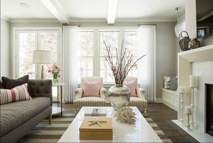
This living room from Kennedy Painting is classically pretty and pulled together without being overly matched or dull.
The breakdown:
- 60% of the room is in the gray family (a lighter gray on the wall pairs with varying shades in textiles—prints help to prevent a flat look!)
- 30% is white or neutral
- 10% shades of pink and metallics
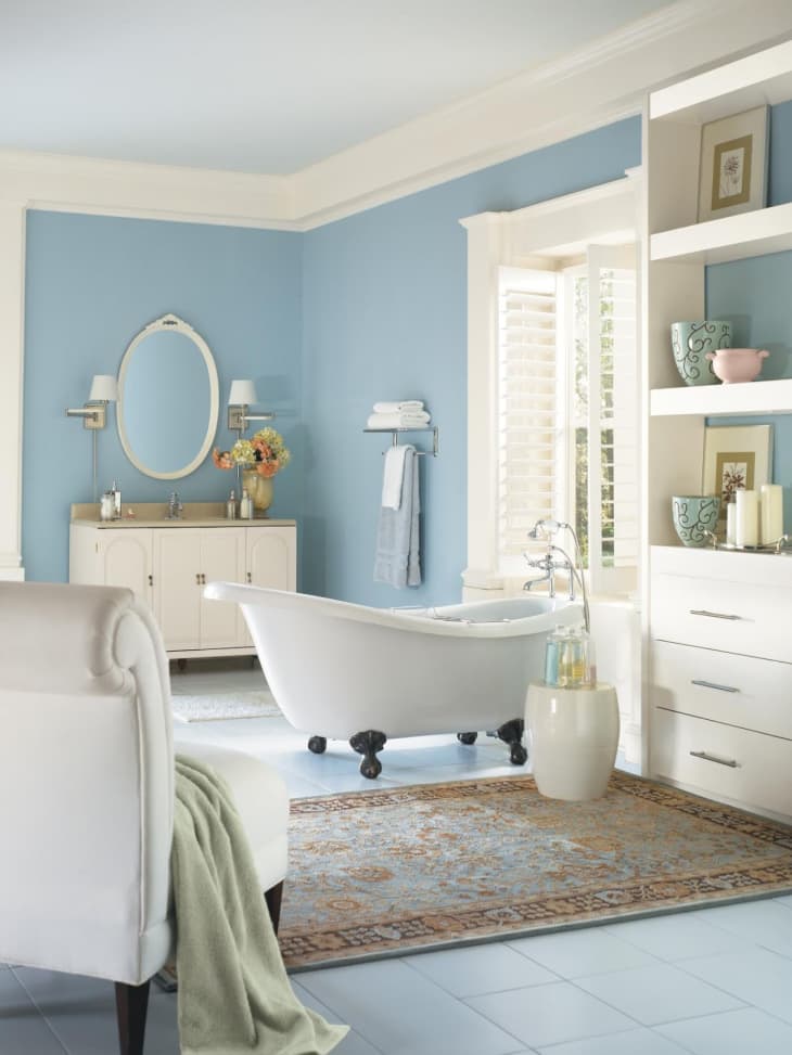
This bathroom (from Olympic Paint via HGTV) illustrates how the 60-30-10 rule is used to create a light baby blue room that is also tailored and elegant.
The breakdown:
- 60% of the room is light blue (basically all in the walls)
- 30% crisp white and cream
- 10% green, orange and pattern brought in through textiles and flowers.
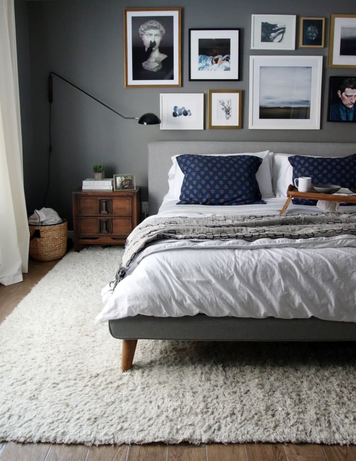
Dark wall colors will dramatically change the mood of a room, but this bedroom via chrislovesjulia shows how using the 60-30-10 rule can work to create a space that is both sultry and bright at the same time.
The breakdown:
- 60% is in the gray family
- 30% is white or neutral through bedding and textiles
- 10% is natural wood and fiber elements, artwork and a metallic black lamp that work together to liven up the space and create lots of texture.
60-30-10 in Our House Tours
I’ve rounded up some examples from our House Tours that nicely demonstrate real people who’ve created lovely rooms that follow 60-30-10. And again, it’s not an exact science but a nice tool to keep in your back pocket when considering how color can work together.
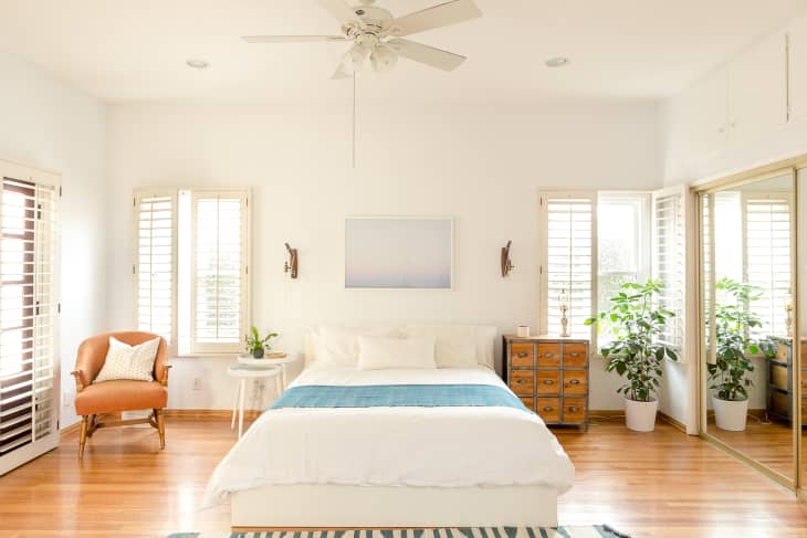
In this example, Sheeva’s bedroom looks cozy and pulled together but still textured.
The breakdown:
- 60% of the room is white or neutral
- 30% is brown or natural wood
- 10% employs shades of blue and green
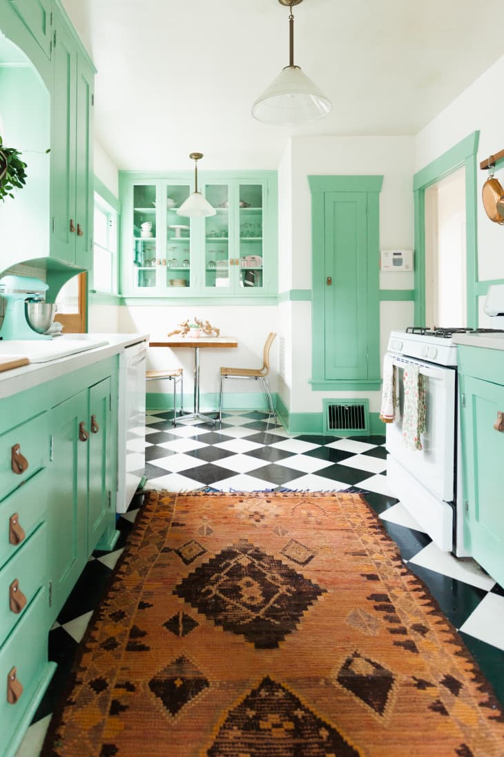
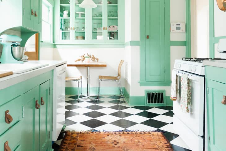
The 60-30-10 rule can be very helpful if you’re nervous about making bolder color choices or worried that a dramatic wall color may swallow a room. In this case, Hayley has created a bright and colorful kitchen that isn’t sensory overload.
The breakdown:
- 60% is Benjamin Moore Southfield Green
- 30% is bright white.
- 10% is brown and tan via patterns (okay, the patterned element is likely more than 10%, but I just love the takeaway that a bit of pattern mixing can work well in a non-matching context).
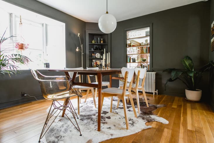
Jes and Caleb’s dining room is another example of a moody (black!) wall color that is nicely balanced out by the 60-30-10 rule.
The breakdown:
- 60% is Sherwin Williams Black Fox
- 30% is natural wood tones
- 10% is white and neutrals, with dashes of metallic and acrylic
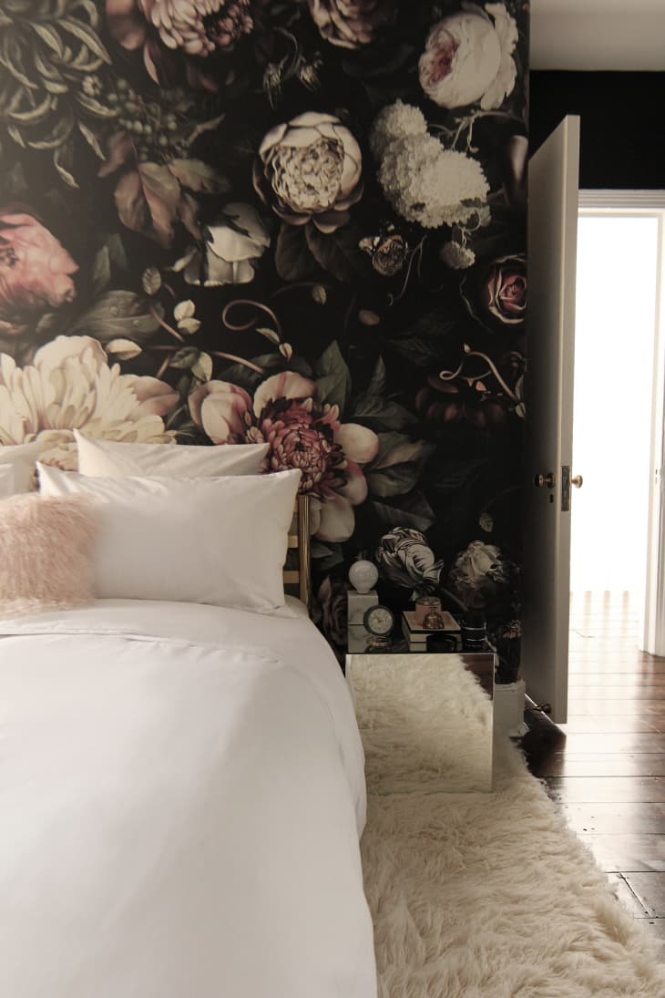
Nadia’s bedroom makeover is one of my all-time favorites and definitely worth reading if you’re considering wallpaper. The room also nicely shows how the 60-30-10 rule can work with a bold printed wallpaper, as the wallpaper anchors the room but doesn’t negatively dominate it thanks to the complementary choices Nadia made that balance out the dark, daring patten.
The breakdown:
- 60% is Dark Floral Wallpaper by Ellie Cashman (in this case, the dominant color is black, with hints of blush, white and gray)
- 30% bright white and creams
- 10% metallics, blush and pink that accent the shades in the wallpaper